Brighten Up Your Images with Color
The colors in a photograph can make the subject or the scene appear so captivating that it quickly grabs your attention. On another hand, an image can also be loud and garish, and can turn out to be an eyesore especially if it shows colors that clash. By understanding how colors affect the viewer, your photos can fully benefit from this powerful photographic element.
The color spectrum is divided into two sides; with cool colors at one side and warm colors at the other. Complementary colors are those on opposite sides of the wheel or spectrum such as green (cool) and red (warm). Keep in mind that some complementary pairs do not look appealing when they are both seen in the image. Another term often used is ‘contrasting colors’, which are colors that are far from each other in the wheel. The further apart these colors are, the more arresting the combination.
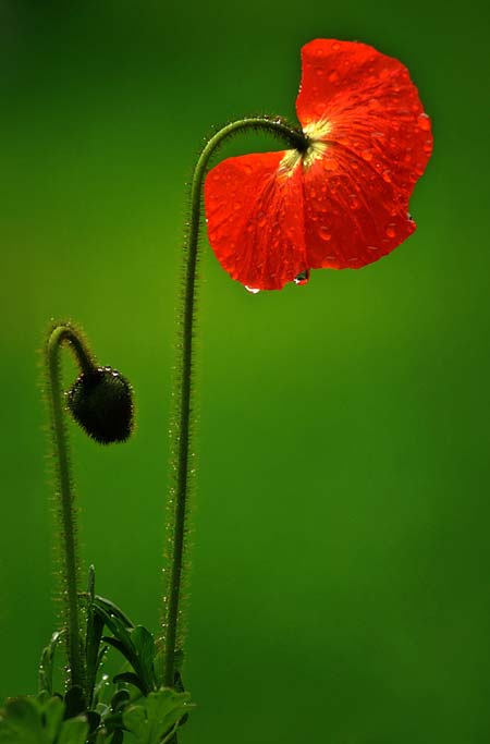
Photo by Funchye
Here are some effective tips on how you can use colors to add impact to your photos:
1. Create a mood – one of the greatest and most powerful uses of colors in a shot is their ability to trigger emotions and evoke a mood. As per color psychology, our visual perception is influenced by color and there are certain hues we are drawn to and some that seem to repulse us. Visual arts, fashion and interior design are just a few related fields where colors play an essential component. In photography, various colors can also subconsciously affect our emotions and here are a few examples:
- Red – this is the color of passion and romance, as well as rage and war. An image with a predominantly red color can be striking to look at and can evoke a strong emotional response depending on how it is used in the composition.
- Blue – this cool color signifies tranquility and peace and a lot of seascape and landscape images have large areas of blue in the frame. Since it is such a serene color, the mood can border on melancholia.
- Yellow – this warm color can display energy and cheer and can often be found in sunset or sunrise images where the entire scenery seems to be awash in a golden glow. If the shade is too vivid, though, it can hurt the eyes and make the viewer want to look away.
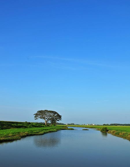
Photo by sierra2u
2. Use lighting techniques – the direction and intensity of the light has a direct impact on colors. For example, if you place a light behind something translucent such as colored plastic, colored paper, or a flower petal, the object’s colors will look brighter and more vivid. Muted or diffused lighting, on the other hand, will soften the intensity of a subject’s colors. Colored lights can also illuminate the subject in an interesting mixture of various hues and shades.

Photo by Lightstaff
3. Selective desaturation – this is a post-processing technique where only a certain portion of the frame is in full color while the rest has been desaturated. With the right choice of the colored subject matter, the image can be stunning and can strengthen the message you want to convey. Selective desaturation will also immediately make the viewer focus his or her attention on the subject.

Photo by ficknoster
4. Show one color against a neutral background – if your subject has only one color, try placing it against a black or white background. This will make your subject stand out since there are no other colors to draw the viewer’s interest away from it.

Photo by Lightstaff
I hope you find these effective tips on how you can use colors to add impact to your photos useful.
About Author
Kristine Hojilla
Kristine is an avid amateur photographer from the tropical Philippine islands. She always tries to capture the extraordinary in mundane objects and scenes. Feel free to visit her profile here to see more of her works


