HDR Photography Tutorial By David Clough-Part 2
After we covered every thing you should know about HDR photography, what you need to know to create HDR and how to set your equipments in the first part of that article .Today ,we will create a practical example for HDR, which covers Processing the image in Photomatix in details and the Final touches in Photoshop. let us start
Processing the image in Photomatix:
OK so we have completed the 1st part and we now have our range of exposures. For the purpose of this tutorial I am going to assume you have 3 exposures at 1 stop apart (0,+1 & -1) don’t worry if not just adjust to include your additional exposures.
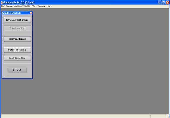
Open Photomatix,
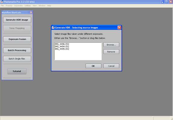
On the left is a list of options but we want Generate HDR Image. Click on this and it will open a browser box. Find your RAW files on your computer and open the 3 exposures you have taken.
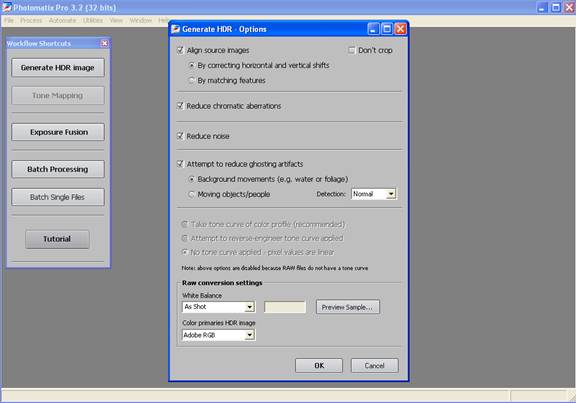
Click Ok. This will then open the HDR Options box. Ensure that Align Source Images is ticked along with reduce chromatic aberrations & Reduce Noise. Also make sure reduce ghosting is ticked.
Now click Ok to generate your HDR. It will take a few minutes to generate but eventually an image will appear and you will gasp at how poor it looks.
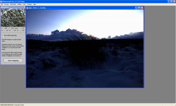
Don’t worry we have finished yet. They all look pretty poor at this stage.
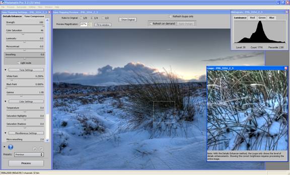
Click Tone Mapping to move on to the next stage. Here you will get a list of sliders down the left and a window in the middle showing your HDR Image.
Making sure you can see the entire image you can change the size of this window at the top to 1/8, 1/4 or 1/2 or fit to window.
Make sure you can see your histogram and leave space for the Loupe Window (read: Magnification Window).
To get the Loupe window open click an area of the image and the window will show you the magnified area of your image. You can use this to spot noise and check the level of detail in the image.
I usually start by placing this over a shadowed area as these are most prone to noise but you can move it around to see different areas as needed.
Ok so we have our working area in order, on to the fun stuff.
The sliders:
Below is a brief description of what each slider has been programmed to achieve and how I have set them for this tutorial. There are some other options and sliders within Photomatix but these tend to be the ones I will use most often and for the purpose of this tutorial the ones we will use today.
Strength:
This slider controls the overall contrast enhancement of the image. This one is about as simple as it gets, 100 the maximum and 0 the lowest. I tend to push this up to 100. You can always revisit and reduce it down before you process the final image.
For the tutorial I have set it to 100.
Colour Saturation:
Like the Strength Slider, 100 is the max and 0 the lowest. 0 will result in a greyscale image and 100 will really saturate your colours. I tend to leave this on the default as saturation can always be changed within Photoshop.
Also be careful of over saturating your image as this will increase noise.
I have set it to 35
Light Smoothing:
This Controls the contrast throughout the image. This setting can manipulate the overall look of the tone mapped image. A high value will make it look more realistic where as a low value will make it look more synthetic. I tend to set this at a higher value as I want to retain some element of realism to my images.
Set to 8.0
Luminosity:
Adjusting this slider will affect the overall luminosity of the image. Pushing the slider to the right will enhance shadow details and brighten the image where as moving it to the left will give a more natural look and has the opposite effect.
For this example image I have set it to 6.5
Microcontrast:
This will set how much the local details are enhanced and increases sharpness.
I have set it to 4.5
White Point – Black Point:
These sliders control the White and Black point, think how black is black and vice versa. Moving these sliders to the left will reduce clipping. Moving to the right will move your shadows towards black or the highlights further in to the white.
For this example image I have set the white point to default 0.250% and the black to 0.075%
Gamma:
This slider has a similar affect to adjusting the global brightness of the image, moving the slider below 1.0 will brighten the image and vice versa.
In order to brighten the image up I have set the Gamma to 0.70.
Colour Temperature:
This will adjust the colour cast over the image, moving to the right will create a warmer image (Yellow/Orange) and the left a cooler image (Blue).
To remove some of the blue cast to the image I set this to 4.0.
Saturation Highlights & Saturation Shadows:
Adjusting this slider above 0 will increase the colour saturation in the highlights/shadows; lower than 0 decreases it.
I didn’t feel that this image needed either the highlights or the shadows adjusting so I left these on the default 0.
Micro-smoothing:
This Slider smoothes out local details enhancements, this has the effect of reducing noise in the image.
Set to 5.5 for the example image.
Highlights Smoothing:
Use to reduce the contrast enhancements in the highlights. This slider is very useful for removing halos around objects i.e. buildings against a blue sky. The higher the value the more of the highlight range is affected.
Set to 20 for the purpose of this example.
Shadows Smoothing:
Like Highlight Smoothing, this reduces the contrast enhancements in the shadows.
This wasn’t really required for this example so I left in on the 0 default.
Shadows Clipping:
This slider sets how much of the shadows range is clipped and can be used to reduce noise in the dark areas of the image.
Clipping was not an issue so again I left this on the 0 default.
Now you have a brief knowledge of how these sliders will affect the over all image you need to play and experiment. Remember to keep an eye on your Loupe Window and your histogram for noise and shadow/highlight clipping.
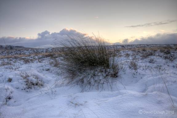
Once you are happy with how the image looks click process. It will take a few moments to generate your final HDR Image once completed save it as a 16Bit TIFF file and open it in Photoshop for the final section of this tutorial.
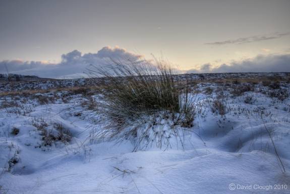
Below is the final tone mapped image I have used for the tutorial.
Final touches in Photoshop:
To be perfectly honest if you are happy with how your image looks at this stage simply save it in what ever format you prefer and voila! HDR completed.
However if like me you feel there is more to the image and want to bring some elements back in or wish to correct some of the affects Photomatix has introduced to your image here are few handy steps.
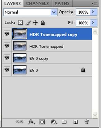
Firstly, I tend to open one of my 3 original exposures in Photoshop. Usually the exposures taken at 0 but if the one take at -1 or +1 better represents the image you are looking for go ahead and use any you prefer.
Once open, duplicate this layer so you can always go back to it if you make any mistakes, hide the layer or lock it.
Open your HDR Image and layer this over the top and duplicate the HDR layer. Your Layer palette should look something like this.
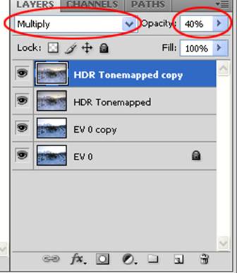
Now reduce the opacity of the duplicated HDR layer to about 30-40% and change the blending to multiply if you wish to create a more dramatic affect or screen if you wish to illuminate it further.
Once done, merge the two HDR layers (Ctrl –E) in to one layer and again reduce the opacity to between 50-70%, blending Normal.
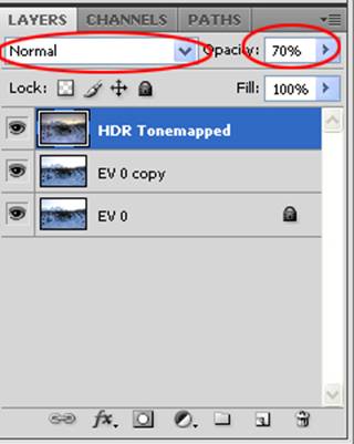
This step brings some of the original photo back through. Although it is at the sacrifice of some of your tone mapping, I find that I gain a balance of detail enhancement and realism that I am happy with.
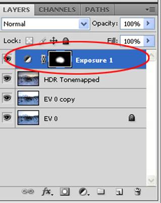
Next I will make any adjustments with the exposure by applying an exposure layer.
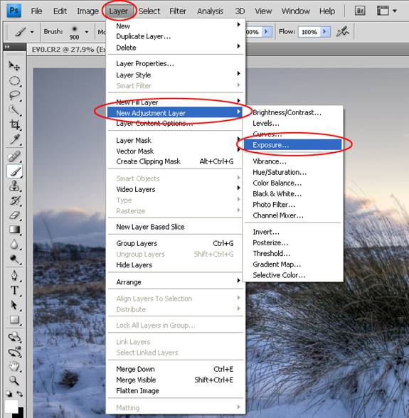
Adjust the exposure accordingly and if there are areas I wish to expose more than others I will use the eraser and paint brush to expose the areas I want to and repeat as necessary for any other areas. As you can see from the example below you can see the effect this will have on the exposure layer mask in the layers palette.
Once I have completed this step I will merge all the visible layers (shift–Ctrl–E), this will leave any hidden layers as a separate layer.
Finally, if necessary, using the burn and dodge tool burn and dodge any areas as necessary.
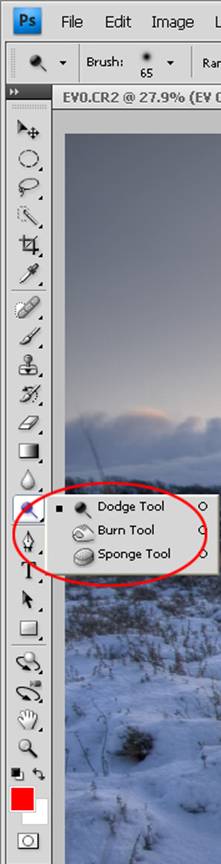
Once you have finished dodging and burning save the image and up load it to the website of choice.
About Author
David
David is a dedicated photography enthusiast who specialises in HDR Photography. David hopes that one day he will be able to take his work on a professional level and feels that the way towards this is to ensure that he learns something new each day. A collection of his work can be seen by visiting his Profile on DeviantArt
